Dulux manufactured by global paint and coatings leader, AkzoNobel, has identified one hero paint colour that perfectly encapsulates and expresses our collective living spaces today: Tranquil Dawn.
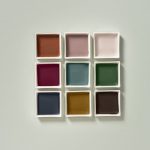
Every year, the Dulux colour specialists at the AkzoNobel Global Aesthetic Centre in the Netherlands create a trends report called Colour FuturesTM. The 2020 report is the culmination of extensive trend research by experts around the world, it’s designed to capture the essence of what makes us human as the dawn of a new decade arrives. It includes a series of diverse palettes around one central Colour of the Year – a stand-out shade that perfectly captures the mood of the moment.
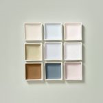
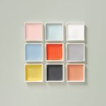
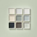
A delicate, fluid shade somewhere between green, blue and grey, Tranquil DawnTM is supported by four palettes, each featuring the Colour of the Year as the hero. The palettes are designed to empower and inspire customers, while making the task of choosing colour easier.
“Tranquil Dawn perfectly captures the 2020 mood of what makes us human,” explains Nathalie Sweeney, Marketing Director Sub Sahara Africa for Dulux – which leads the annual trend research within this region. “It’s reminiscent of the colours of the morning sky and our desire to treasure our most human qualities, which we’ll need as we enter a new decade.”
For homes, the four supportive colour palettes each featuring Tranquil DawnTM meet a series of distinct needs while also enabling consumers to express themselves. The palettes are known as The Care Palette, The Play Palette, The Meaning Palette and The Creativity Palette.
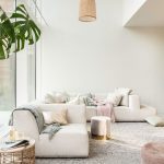
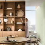
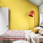
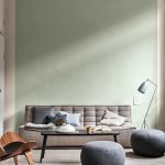
The Care palette is soft and airy. The pared-back mix of gentle neutrals, including the Colour of the Year Tranquil Dawn, is reminiscent of the horizon of a hazy spring morning – where the colours of dawn flow into one another.
Pale wood and suede are used alongside tactile velvets and wool throws to bring warmth to this contemporary look, while silvers, golds, coppers and mother of pearl introduce a precious element. Plants and botanical prints that bring the outside in, and boost a sense of wellbeing, pairs well with these colours. This palette allows you to create a space for time to focus on what really matters; relationships, relaxation and YOU.
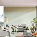
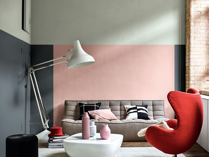
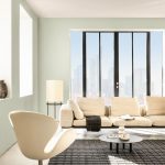
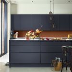
The Play palette brings a transformative energy to the home – a mood that is young and vital, modern and relaxed. Inspired by the colours of the horizon on a bright summer day, mixing softer shades like Colour of the Year, Tranquil Dawn, with smaller blocks of bold colour, such as coral and Sulphur-yellow brings an offbeat vibrancy to the palette. The play home is light and bright with geometric patterns and a material mix that includes ply and statement accessories in bold textures. It unlocks an environment that stimulates the senses and delights its inhabitants.
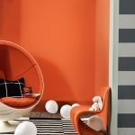
This palette allows you to create a space to be open and receptive to playful experiences.
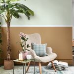
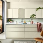
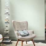
The Meaning palette allows for a space of silence and contemplation, awe and wonder. This home is pared-back and minimalist – but in a human way; comforting and comfortable, with an air of monastic calm. A subtly nuanced palette of crisp greys evokes the clear horizon of a cold winter’s day, with Colour of the Year, Tranquil Dawn, at its heart. Clean lines and functional forms complement elemental and tactile materials that include natural wood, leather and linen, as well as the soft sheen of gently polished concrete. This palette offers a simple way of living that is luxury in its purest form. The Meaning palette allows you to create a space where you can be still and free of distractions, to focus on purpose and values.
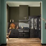
While the Creativity palette encourages to build your own narrative. We tell stories that blend old and new, taking the past and making it our own. The Creativity palette is rich and saturated, inspired by the colours of a warm autumn day and full of intense tones, including forest greens and earthy ochres, as well as paler, in-between shades like Colour of the Year Tranquil Dawn. This home uses the time-honoured materials of the past – wood, leather and pottery – but in a modern context, alongside painterly florals, printed cottons and hand-knitted throws. Texture and tactility help to create spaces that are moody, atmospheric and eclectic.
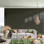
This palette allows to indulge curiosity, elicit creativity and celebrate perfect imperfection.
The 2019 edition of Colour FuturesTM tells the story of how global trends are transformed into inspiring paint colour palettes for the home, from room to room.
“The easy-to-use palettes promise to bring a fresh energy to the world’s walls, and with the versatile Colour of the Year 2020, Tranquil Dawn, at the heart of this colour collection, we’re inspired to do just that,” Sweeney concludes.
For more tips on how to do it yourself and turn old to new, visit the Dulux social pages Facebook, Twitter and Pinterest or Instagram.
